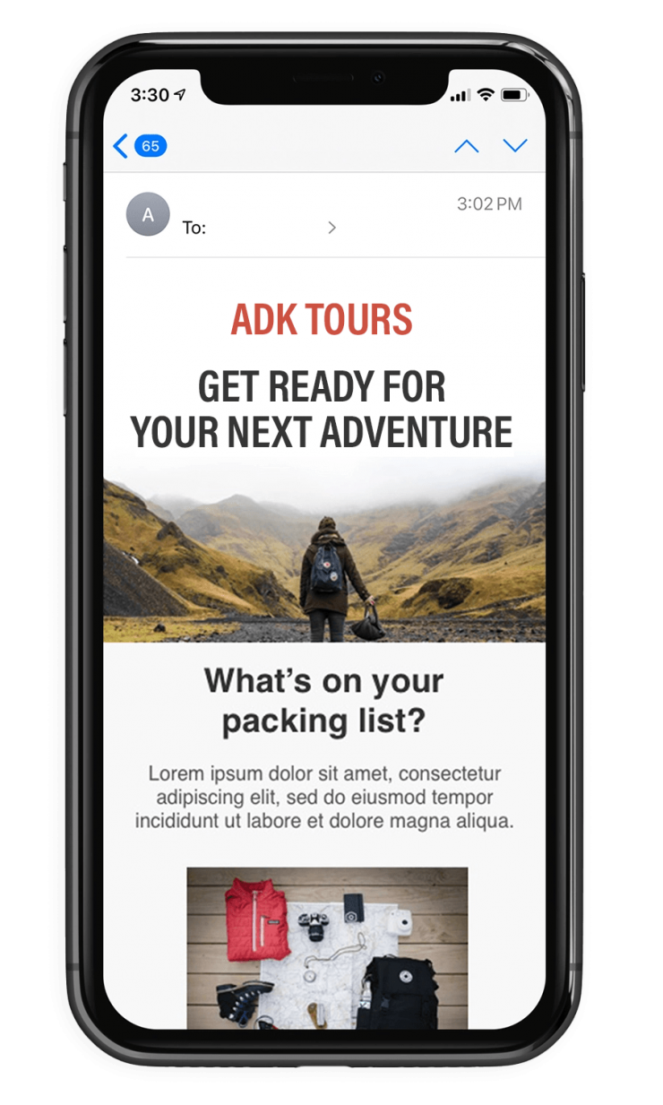
Responsive email delivery
Marketing is changing every day, and keeping up with these changes can be challenging. Take email marketing, for example. It’s come a long way since 1999. One of the most important developments in this area has been the application of responsive emails.
What is responsive email?
A responsive email message has special coding that allows it to display perfectly across different devices. For example, without making use of responsive emails, the same newsletter that shows up perfectly on a PC monitor can look "broken" on a mobile device or may not show up at all.

With the two CSS layers, your newsletters will be responsive, which will allow them to show up crisp and clear, whether your recipients open them on a PC or a smartphone.
We're sharing this with you to let you know everything that's happening behind the scene's with the AXNT responsive email templates. These templates are mobile-responsive and ready to go, and built in to every account.
Reponsive Design
Responsive design— sometimes called fluid layouts— is an approach to coding of HTML layout to accommodate for the many different screen sizes that exist today. Using responsive design techniques allows a flexible design that responds to phone, tablet, laptop, and desktop screens... all from the same content source. One email, looks great everywhere.
Responsive Email
A responsive email has special coding that allows it to display perfectly across different devices. Without making use of responsive emails, the same newsletter that shows up perfectly on computer can be illegible on a mobile device. With AXNT™ you don't have to worry... we provide responsive layouts for everyone!
All You'll See Is Results
With AXNT™ responsive emails you'll notice higher open rates, click-throughs, and subscribe rates paired with a much lower unsubscribe rate. Responsive emails are no longer optional for today's senders. Responsive emails have become an expectation.
How to measure the success of responsive emails
To measure the success of your responsive emails, you should be using the same metrics you’ve been using for your email marketing campaigns. Compare your click-through, open, subscribe, and unsubscribe rates to the figure you were getting before implementing responsive emails.
What you should see are higher open, click-through, and subscribe rates paired with a much lower unsubscribe rate. Without responsive emails, people who subscribe to receive your newsletters will quickly unsubscribe if your emails display poorly on mobile devices. Do the smart thing and get on board; start using responsive emails today and stun your customers with compelling email content that AXNT can deliver.
Does it really matter?
In marketing today, responsive emails are shifting from optional to necessary. Responsive emails have become an expectation.
The demand for responsive emails has grown in tandem with the sharp rise in users who read emails straight from mobile devices rather than a PC. If your newsletters, update emails and notices aren’t optimized for mobile devices, they’ll display poorly— or not at all— and turn customers away.
The number of emails opened from mobile devices jumped 500% in a 3-year span.
That kind of incredible growth speaks volumes. With so many people opening emails from mobile devices, it’s imperative that your newsletters be mobile-friendly, meaning you should be using responsive emails.
AXNT™ Delivers
Now that you know more about responsive emails, what they are, and why they’re important, it’s time to start putting this knowledge into action. Responsive emails are going to be an important growth tool for all email campaigns.
Knowing how to make and use responsive emails that perform well on mobile devices has become a chief responsibility among email designers. AXNT™ handles all of these details for you automatically and behind the scences, allowing you to focus on sending great email.


